

DESIGN QUESTION
Background
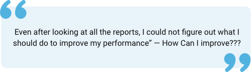
How might we help students understand their test results and increase their efficiency and performance?
While the number of students taking online tests and test preparations has increased in the past few years, it is increasingly overwhelming for students to understand their exam results and progress over multiple exams.
Outcome
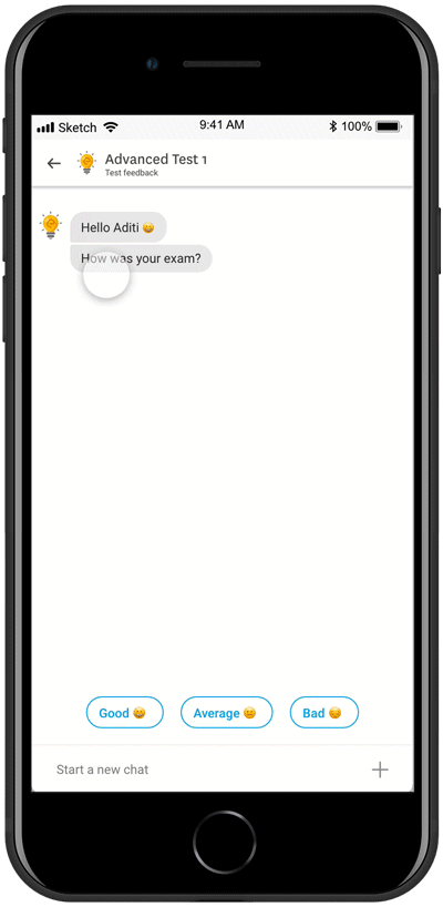
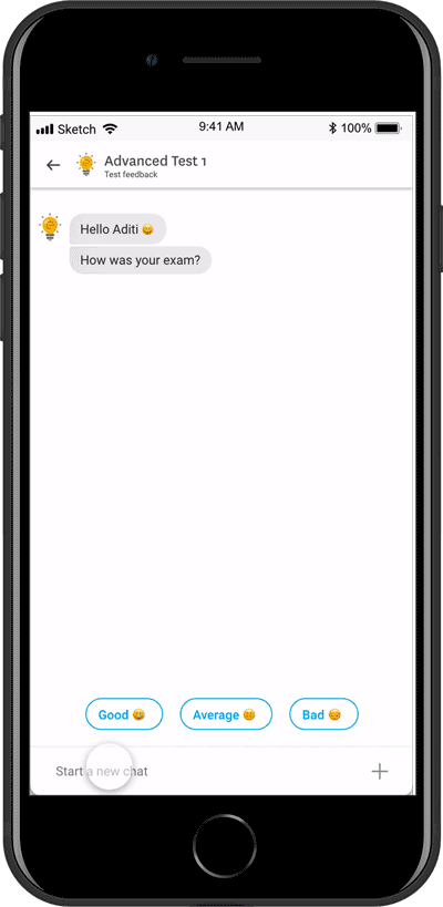
Pariksha is a mobile-based chatbot dedicated to helping students understand their test patterns and helps them in improving their performance in upcoming exams.
Duration
3 Months
Role
Product designer (Team of 4 members).
PRODUCT JOURNEY
The project started with the core idea of making digestible test results and analyses for students. Initial desk research into the domain highlighted the critical issue numerous students face today. Through further analysis and opportunity identification, a solution was created and detailed. The following document elaborates on each of these steps.

MARKET STUDY
To learn about the usage of chatbots for communication, different types of a chatbot available in the market are analyzed. Google Assistant, Google Allo, Lark, and Ruuh are mainly studied. We concluded to use suggestion-based conversation to keep the user focused on the conversation and avoid any confusion.
After problem identification, possible existing market solutions were studied and analyzed for their usefulness in helping students understand their exam results. We focused on understanding the competitors’ strengths, weaknesses, and strategies.

PROS
CONS
- Some of them provide video tutorials for wrongly attempted questions.
- They use visuals to represent the score and progress.
- Some try to compare the results with previous exams and show progress.
- Competitors provided test results overview.
- No detailed report and analysis are available.
- Visuals available now have too much information to be digested
by the user. - Do not provide personalized feedback or suggestions to users to improve their performance
- The present experience of feedback and report systems makes
users spend little time analyzing. - No relevant concepts or materials are available after the test.
USABILITY TESTING ON PRESENT PLATFORM
To understand the pros and cons of where the present report and analysis system is failing, usability testing is conducted with 12 students.
Insights

USER INTERVIEWS
We conducted twelve in-person semi-structured interviews with potential users(students preparing for undergrad school, banking exams, and BIPC students). The questionnaire mainly focuses on their reading patterns, exam reports, and real-life analysis.
Insights
84%
60%
64.2%
73%
73%
63%
Need error analysis
Save wrongly attempted
questions
Worried about time
management
Have a short note
written
Do self Assessment
Make a comparison with
toppers

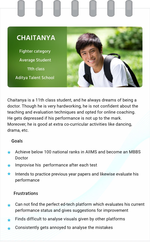
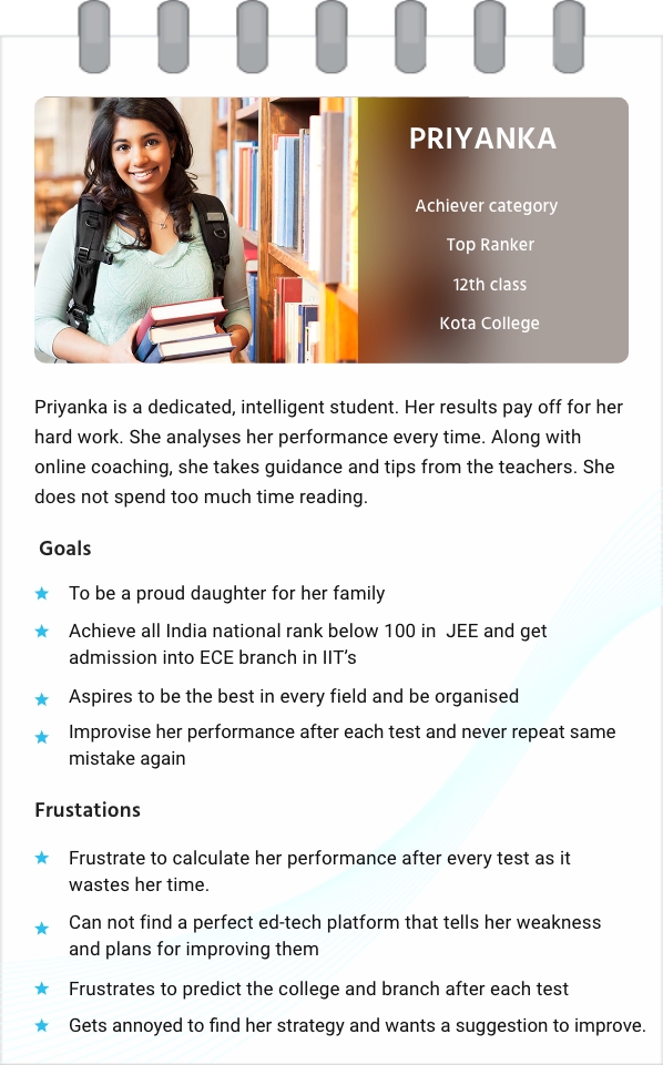
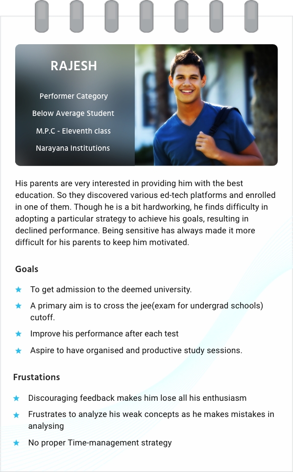
PERSONA
We conducted a thematic analysis session with the data gathered through user research and developed personas.
DESIGN GOALS

IDEATION
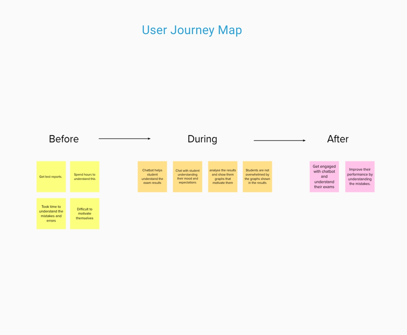
User Journey Map
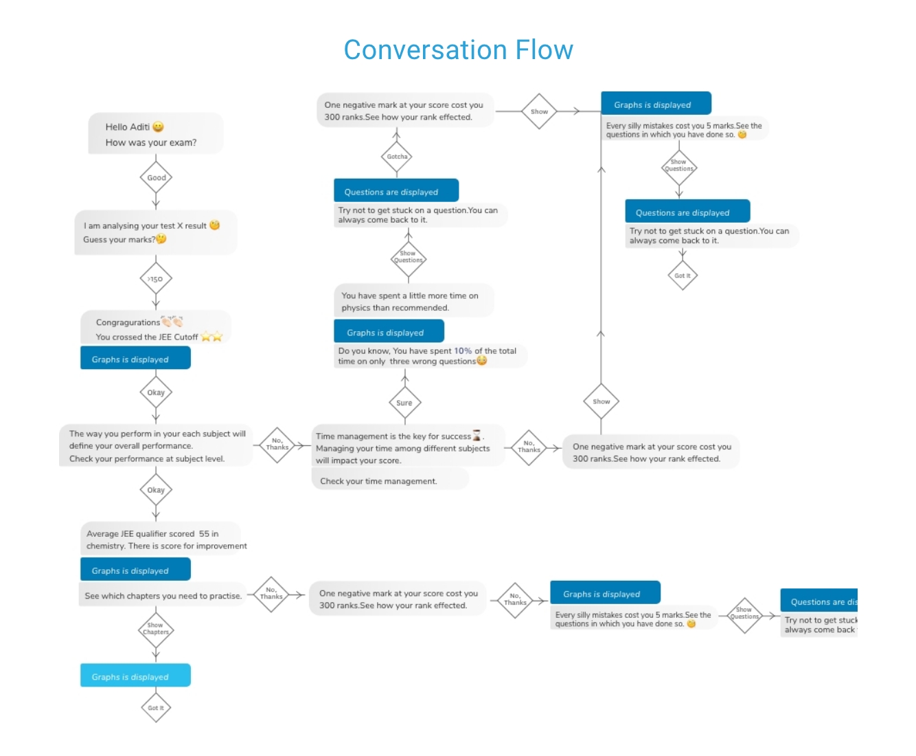
Conversation Flow
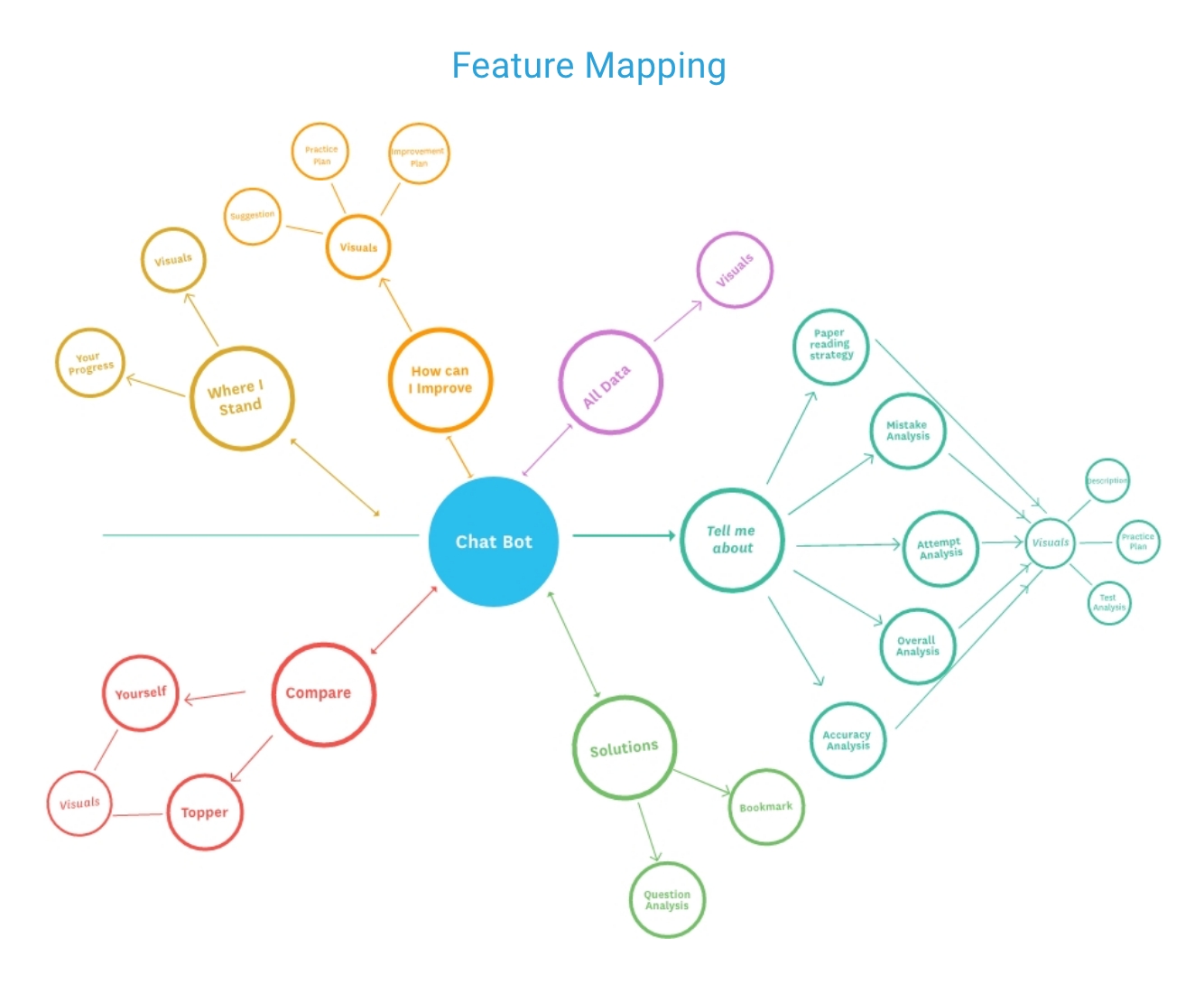
Feature Mapping
USABILITY TESTING ON VISUALS
Graphs available now in the platform are segregated into digestible graphs focused on delivering only one piece of information. We came up with these final designs based on the usability testings on visuals.


FINAL DESIGN
The following session covers some of the key features of the platform.
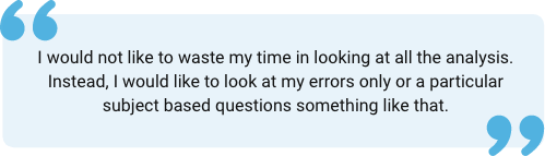
1. HOW CAN I IMPROVE?
Design Goal: “Educate them on their weaknesses/ mistakes and improve their overall performance.”
This feature helps students focus on areas where they are weak and provides practice sessions to overcome this weakness. They can do them right up front or look at the pdf sent to them at the end of the chat session.
2. TELL ME ABOUT
Design Goal: Provide users with an in-depth digestible analysis of their exams.”
This feature helps students get an in-depth analysis of their attempts, accuracy, mistakes, a strategy they are implementing, and how they can be improved. It shows them the questions deviating from ideal techniques or strategies and provides them guidance at the question level.
3. WHERE I STAND
Design Goal: “Keep users motivated to push themselves towards their target”
This feature helps students focus on areas where they are weak and provides practice sessions to overcome this weakness. They can do them right up front or look at the pdf sent to them at the end of the chat session.
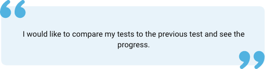
4. COMPARISONS
Design Goal: “Keep users motivated to push themselves towards their target.”
This feature helps users focus more on their progress than previous exams and sometimes with fellow students.
LEARNINGS
- Creating the milestones and how to achieve them while designing a chatbot, data visualization with better aesthetics.
- Prioritizing information according to user requirements.
- Conducting usability testing with potential users.
- Creating product both from user and company perspective based on information available and limitations
Selected Works
Working hour complianceEnterprise UX / Data Dashboard
BOC and CAPsEnterprise UX / Compliance Platform

Unifying internet management to boost engagement with Lumen’s Quantum Fiber app.Consumer Product Design / Multi-user Experience


Seattle Audubon SocietyNonprofit UX / Platform Redesign

CamcartAn E-commerce app for renting and buying

Circular Train JourneyService Design / Complex Workflow Design
Wish to speak with me
Reach me at haasinisai01@gmail.com


