

TL: DR Summary

Background
Seattle Audubon Society (SAS) has been one of the US’s largest independent, volunteer-driven Audubon chapters since its founding in 1916. The organization is currently re-evaluating its online presence. It is rebranding to promote a more EDI-centric representation, a more distinct and usable online presence, and attract a more diverse and balanced membership base to sustain the organization’s work.
Outcome
Redesigned web platform by merging two of their websites along with brand guidelines
Team
Haasini Sai, Mina Ryu, Zifan Zhang
My Role
UX & Interaction designer
Skills
User research and synthesis Product scoping, Information Architecture, Testing
Visual & Interaction Design
Timeline
Apr’22 - Jun’22 (6 Weeks)
What does Seattle Audubon Society do?
Seattle Audubon Society (SAS) has been volunteer-driven Audubon chapters in the US since its founding in 1916. It has two significant online inventories: one for visitors to understand the story behind the organization and drive growth metrics; another is BirdWeb serves as a dedicated portal for people to learn about birds.

MISSION: Envision cities where people & birds thrive

Stakeholder Expectations

Adapting for the younger and the older generations

Increase signup for memberships, donations & Newsletters

Increase awareness & discoverability of SAS’s works

After having multiple calls with stakeholders, we as a team decided to start with user research and site analysis to understand users’ frustrations and needs. So I framed the main research questions to address
Research Questions
1. What is peoples’ understanding of the Seattle Audubon Society?
2. What are the problems faced by the present audience (The older population)?
3. What are the expectations and requirements of the younger generation from the Seattle Audubon Society?
Research methods

Heuristic Evaluation
We ran a heuristic evaluation using Nelson Norman's principles to understand the issues from the designer's perspective.

Accessibility Check
Since the product is used mostly by retired people it is important to make sure that the product is made accessible for all. Ran accessibility check on the platform

Competitor Analysis
Analyzed the services of 7 other competitors in the bird conservation domain

Surveys
Surveyed 216 people to understand user trends, attitudes, and experiences with SAS

Usability Testing
Conducted 5 usability Tests ( 3 new users+ 2 membership owners) to understand the usage of the platform
Key Insights
01
02
03
04
Unclear Information Architecture
While performing tasks in usability testing, all the users used to navigate to some
other places or take long detours to reach the right place. This indicated that there
is a need to revise the information architecture.
Text is heavy & Info is not clear
From heuristic analysis, surveys and testing, it was evident that users take a lot of time to find the information from the pool of information available. Sometimes, users take help from customer service to find the information.
Not accessible - No zoom, color contrast
The majority of the current customer base is in the age group above 50. Making the website accessible for them is important, and according to the web accessibility check, SAS websites do not maintain color contrast, zoom, or keyboard accessibility.
Difficulty in finding main features - Jargon
While conducting usability testing with novice users, we understood that they could not understand much bird-related jargon.


User Task Matrix

Personas
Based on the research, I understood that we are redesigning the platform so younger generations and people above 50 can use it. So it is important to create personas to bring all the clients and team into one page. One of our project goals is to attract a more diverse group of people, including the younger generation, so the behaviors were set to reflect that direction.


Oppurtunity Areas
After analyzing the findings of primary ad secondary research, due to limited time, we scoped the emerging opportunity areas are as follow

Decrease bounce rate by guiding users to features easily

Enhancing the site’s experience for older adults contributes to 80% of users.

Increase awareness & discoverability of SAS’s works

One of the major issues we identified was navigation. We conducted a card sorting study to evaluate the information architecture of the current website. In card sorting, participants organize the cards with the website's items into groups in a way that makes the most sense. A total of 22 people participated in our card sorting study. I worked on the information architecture and developed a new global navigation bar to help users navigate the website after multiple iterations. We, as a team, parallelly conducted the tests to ensure the Information architecture was according to the users' mental model.
Iterations

All the users 18/22 came up with the “about us” section. So we placed the about us section in our new information architecture. But in the usability testings, we shifted the about us to the starting place instead of at the end.

3/3 - Struggled to locate the community science program in the nav bar in one of the tasks in usability testing. So we segregated the section and kept it outside.
After series of iterations, we came up with final Information Architecture


Low Fidelity Screens


Once Low fidelity screens are made, to check if the screens are according to users’ mental model or not, we conducted 5 usability testing sessions. We created 8 tasks on the main features of the website.
Hypothesis
1. Is the new Information Architecture helping users to discover features easily?
2. How easy is the platform for novice users? Can they navigate easily?
3. Is the new design more accessible for senior customers?
Success Metrics

Analysis
After collecting the data from usability testing, I conducted affinity mapping.
What worked
1. Users can spot nature shop easily.
2. Merging the bird dictionary in the main website made users easily access it
3. Users felt it is easy to find newsletters and membership pages
4. Volunteering for events is made easy
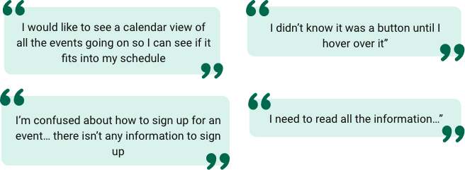
What did not work
1. User expected to see a calendar view
2. Membership signs & donation flow is confusing
3. Membership signs & donation page gas too much content
4. Reordering elements in nav & sub-nav bar

Example of Iterations
Before usability testing

COMMENTS RECEIVED
After Iteration


Visual Design
The team proposed a new color scheme for accessibility reasons because the current colors fail to meet the WCAG guidelines. Website colors and text is not accessible, not following proper color contrasts. So we proposed some new colors by retaining green as the primary color; since we are dealing with conservation, green can evoke such emotions. Stakeholders mentioned that they do not wish to change the font, so we are following the same fonts: Cinzel & source sans pro

High Fidelity Screens
After finalizing the visual design, I started creating a design system so that SAS could use this design system for future usage. I started redesigning the main screens based on design language.

Home Page
The redesigned home page tells the organization’s story and mission in diversity & inclusion and emphasizes the community aspect.
We also put memberships & donations, which are required for the organization’s revenue.
Current
Proposed


Membership page
Previously, the donation and membership page were kept together, which caused confusion. Separate membership page is maintained.
Proper CTA buttons are maintained for easy accessibility, and text is chunked.
Current
Proposed


Event Page
To match with users’ mental model, the calendar view is made the default view, along with color coding of the type of events.
Extra CTAs are added and disabled based on the context. This reduced the confusion.
Current
Proposed


Shop Page
Through research, we found shop page is not useful. So we redesigned the shop page based on the main selling categories from the store.
We also encourage the users to have a live scoping experience by using more photos.
Current
Proposed


Volunteer Page
According to the research, users take too long to find the information. So we categorized the volunteering activities and used tabs to categorize them.
CTA for joining as a volunteer is made more prominent, and information is chunked for easy absorption of content.
Current
Proposed


Birdweb Page
Changed the second website's design language so users can feel consistency across different SAS websites. Gave much priority to search functionality, and CTA was made clear.
To promote the competitive spirit in the users, we put up the bird of the week, bird siting of the week upfront.
Current
Proposed

Selected Works
Working hour complianceEnterprise UX / Data Dashboard
BOC and CAPsEnterprise UX / Compliance Platform

Unifying internet management to boost engagement with Lumen’s Quantum Fiber app.Consumer Product Design / Multi-user Experience


CamcartAn E-commerce app for renting and buying

ParikshaConversational UX / Data Simplification

Circular Train JourneyService Design / Complex Workflow Design
Wish to speak with me
Reach me at haasinisai01@gmail.com


