Reimagining settings navigation for Indeed's enterprise employers
Replaced fragmented and duplicative settings with a single global hub — helping employers find, manage, and update account, team, and company settings while reducing confusion and support cases.
Context
Indeed connects 300M job seekers with 3M employers worldwide. Independent product teams built employer-facing products separately, resulting in fragmented, inconsistent settings. Enterprise customers struggled to find and manage key accounts and company preferences, leading to frustration and support requests.
Problem
Employers faced fragmented settings across multiple products. Simple tasks, like updating an email, required visiting several locations. Repetition, inconsistent UI, and unclear affordances increased cognitive load. Teams building new products often duplicate settings like language or country. The core issue was poor discoverability of functionalities, which created most of the confusion.
Goal
Create a unified global settings framework that consolidates account, team, and company settings into one hub, improves discoverability, reduces navigation friction, and provides a scalable foundation for future product growth.
Process
Over 10 weeks, I partnered with a UX researcher and stakeholders to audit existing settings, benchmark competitors, gather client feedback, and translate insights into an IA. Card sorting, tree testing, and concept testing validated and refined the framework.

New Indeed enterprise settings
Research
The project began with a goal to reduce customer support calls related to settings. To understand why users struggled, we audited 14 product areas and 44 settings categories, benchmarked competitors, and surveyed 67 enterprise clients. We then ran card sorting and tree testing sessions to capture users’ mental models. Research revealed that the primary issue was discoverability—users weren’t struggling due to a lack of features, but because they couldn’t find them easily. This insight became the guiding principle for redesigning the IA.
Research methods
Auditing existing portal
Audited 14 product areas and 44 settings categories to determine the functionalities and list issues users may face
Competitor Analysis
Ease of completing six popular settings tasks (e.g, changing a password) was measured using Abby Covert’s Information Architecture Heuristic Framework and graded against Indeed.
Client Surveys
167 responses were gathered to analyze the frequency of usage and identify the root cause of setting issues with clients.
Findings
72% of surveyed clients had trouble distinguishing company vs. account-level settings.
60% of support cases involved navigating multiple locations for the same functionality.
Benchmarking revealed that 80% of competitor settings tasks were consolidated under one hub, compared to 35% at Indeed.
Internal audit revealed 12 duplicate categories (e.g., language, billing) replicated across products without a common framework.

Persona analysis: Understanding who uses the settings
Research included analyzing four enterprise personas—Instance, User + Advertiser, User, and Advertiser—to understand which settings each role needed most. Insights from this analysis guided a card sorting activity, which helped prioritize which functionalities should be most visible and accessible. Subsequent tree testing validated the navigation paths, helping us create a scalable information architecture aligned with user mental models.
I analysed what kind of settings needed for each persona. This helped me to understand hierarchy.
Making the navigation right: Information architecture
Insights from persona analysis guided card sorting to define intuitive groupings of settings, and tree testing validated the navigation paths. This resulted in a scalable information architecture with a clear hierarchy, labels, and multiple access points for key features, making it easier for users to find and manage settings efficiently.
Card sorting
Tree testing
Discoverability is the main issue with settings. So it is important to work on the Information Architecture.
Testing two concepts: Balancing innovation with familiarity
After finalizing the new information architecture from card sorting and tree testing, I presented it to leadership. While the structure improved discoverability, it differed significantly from the existing architecture, and several product teams were concerned about alignment and implementation effort.
To address this, I designed and tested two concepts with employers to evaluate performance and preferences:
Concept 1 — Unified Settings Hub
All key functionalities were centralized under the Settings hub. Multiple access points were provided for Access & Permissions, Resume Subscription, and Billing, aligning with user expectations revealed during card sorting and tree testing.
Concept 2 — Incremental Enhancement
This concept retained elements of the existing IA, keeping Access & Permissions, Resume Subscription, and Privacy outside the Settings hub to maintain familiarity for teams.
Usability testing
We conducted 8 moderated usability sessions with enterprise employers to measure efficiency and gather qualitative feedback. Participants were asked to complete common settings-related tasks, such as updating communication preferences, checking billing details, and managing user access.
Goals
1. Evaluate which concept was more effective and efficient for completing settings tasks
2. Assess if Resume Subscription and Access & Permissions should be grouped under the main hub
3. Measure engagement with the new Overview Page
4. Identify contextual needs for employers while managing settings
Key findings
Usability testing with 8 enterprise employers revealed clear efficiency gains and actionable feedback.
Tasks in Concept 1 (new IA) were completed 37% faster on average than Concept 2, with participants locating key actions (e.g., permissions, billing) 50% more accurately.
However, 62% initially struggled to find the settings entry point in the header, signaling a need for clearer global navigation.
100% of participants preferred having all settings consolidated in one hub, validating the unified structure.
Half of the users asked for additional 2FA options to enhance security and trust.
7 of 8 participants preferred Concept 1, describing it as “clearer” and “more predictable.”
75% of users requested separate spaces for employer vs. job seeker communication settings to avoid confusion.
5 out of 8 participants recommended keeping Resume Subscription distinct from Access & Permissions.
The new Overview Page was well received by 6 participants, though 4 suggested adding personalization to surface relevant updates and payment details.
Final design
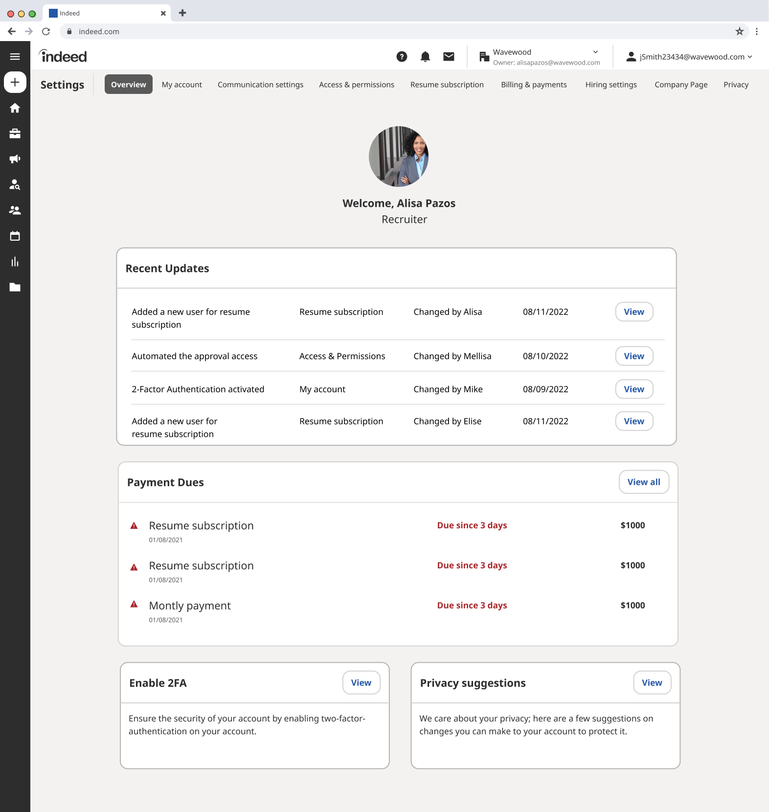
Insights from testing shaped a unified, intuitive settings experience designed for scalability and clarity. Each page was built around employer priorities — discoverability, transparency, and control.
Overview page
The Overview Page serves as a personalized command center where employers can quickly access essential account and company details. It highlights key updates such as profile changes, billing summaries, security reminders, and pending access requests. By surfacing high-value information at a glance, the page reduces navigation loops and helps employers identify and act on important tasks faster, improving overall discoverability and control.
Access and permissions
This page centralizes all user roles, permissions, and activity tracking into one intuitive interface. Employers can view existing team members, assign or revoke roles, and monitor recent access changes — all without switching between products. The design emphasizes clarity with role-based groupings and status indicators, aligning with enterprise expectations for transparency and governance.
Hiring settings
Centralizes all recruitment configurations — including job posting preferences, language, and country settings — in one place. Defaults auto-fill from company profile, reducing repetition and setup time while ensuring compliance and consistency across hiring tools.
Resume subscription
Gives employers full visibility into license details — showing assigned seats, usage summaries, and billing info. Quick actions let teams add or transfer seats independently, increasing transparency and reducing support calls.
Future Scope
01
02
03
Design primarily targets admins, assuming that certain functionalities can be removed for other users based on their credentials. It’s important to verify this concept with non-administrative users
Need more research on the header to make changes to it.
1. Settings icon - can we place it next to other icons
2. Two dropdowns - can we make it one? It is confusing for users
Need detailed research on how can we best separate employer and job seeker settings
Selected Works

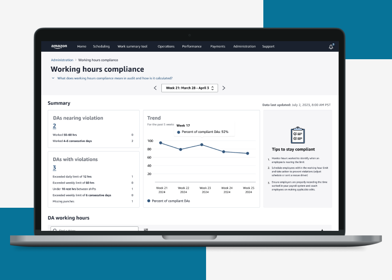
Working hour complianceEnterprise UX / Data Dashboard

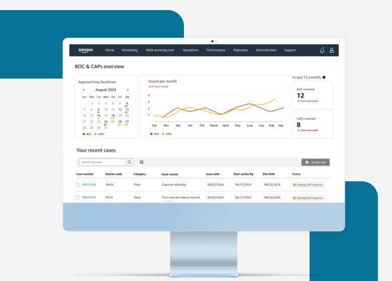
BOC and CAPsEnterprise UX / Compliance Platform
Unifying internet management to boost engagement with Lumen’s Quantum Fiber app.Consumer Product Design / Multi-user Experience
Seattle Audubon SocietyNonprofit UX / Platform Redesign
CamcartAn E-commerce app for renting and buying
ParikshaConversational UX / Data Simplification
Circular Train JourneyService Design / Complex Workflow Design

